Campaigns Worth Knowing: Samsung, Reebok and Breitling
Business Blog / April 7, 2015
The average ad needs to grab a person’s attention in just a couple of seconds and spark interest. Too much information can make consumers lose sight of the most important part of the campaign: the product.
This is one reason the ads on Flipboard have room to breathe. Our full-page creative presents ample space, allowing for both product and context to shine. And we love to see how brands use visuals to express the essence of their products. Here are a few examples of advertisers who are doing an amazing job of running product-centric campaigns with beautiful and creative imagery.
LESS IS MORE
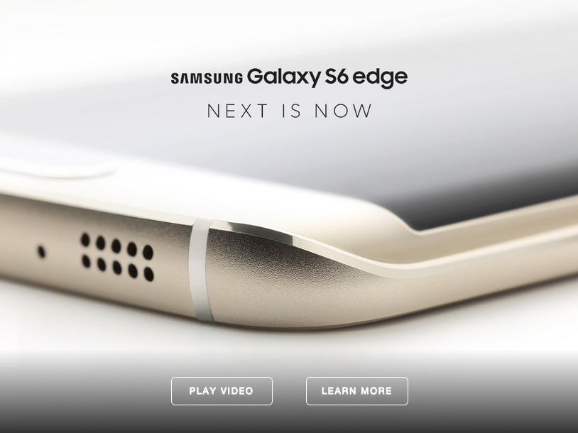
Samsung has released a sneak peek of its super sleek Galaxy S6 edge phone, which comes out on April 10. The copy and typeface surrounding the image of the phone are just as minimalistic and tasteful as is the product itself.

FASHION MEETS FUNCTION
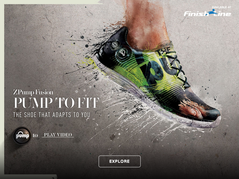
Reebok is promoting its new ZPump sneaker with a Jackson Pollock-esque concept. The Pump To Fit creative highlights the ingenuity and adaptability of this seasoned brand’s fresh take on a throwback tribute to their pump footwear technology first designed in 1998.
Learn all about the history of the Reebok pump in this slideshow by Sneaker Freaker Magazine.

GO BIG OR GO HOME
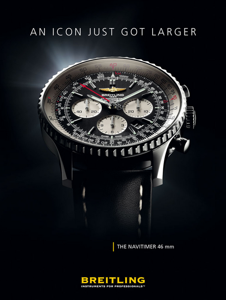
Breitling has placed its product, the Navitimer timepiece, front and center in this ad, taking up almost the entire space to show off every customized detail. The attention-seizing size of the watch image is fitting since this is the first time that the company has released a 46mm diameter XL version of its 60-year-old Navitimer model.

The ads for the Samsung Galaxy 6, Reebok ZPump, Breitling Navitimer 46mm and many other beautifully showcased products are running across Flipboard this month.
~AndrewZ is curating “Fit Life”
GET FLIPBOARD ON:
iOS / ANDROID / WINDOWS / WEB
FOLLOW US ON:
FLIPBOARD / TWITTER / INSTAGRAM / FACEBOOK / GOOGLE+ / TUMBLR / YOUTUBE / SOUNDCLOUD / PINTEREST / MEDIUM


